Movie buffs have the Oscars, Broadway devotees have the Tonys, and sports fans have
the playoffs (pick your sport). For interior designers and fashion lovers, there’s another
annual announcement we eagerly anticipate: the Pantone Color of the Year.
Since its first Color of the Year announcement in 1999—and the introduction of
seasonal color palettes, or “trend reports,” in 2000— Pantone has given us an annual
glimpse into the colors we’re likely to see everywhere. These collections of shades are
a fascinating combination of reflection, prediction, and curation.
The colors selected each season are distilled from current socioeconomic trends, media
and the arts (including film and entertainment), and technology. For autumn, they reflect
the annual shift from the high energy and brightness of summer to a chill in the air and
longer, cozier evenings. We tend to ease into a desire for comfort and warmth in the fall,
both physical and emotional. And the more chaotic the world feels, the more we seem
to gravitate toward nature—its colors, textures, and sense of calm.
As an interior designer, I appreciate that it would be wildly impractical to overhaul our
homes or offices every season. Yet a quick look at Pinterest or the aisles and websites
of home décor retailers makes it clear that we still want our interiors to adapt to the
season. Most often, that happens through smaller touches: pillows, throws, accessories,
and exterior decorations.
It’s the interior design equivalent of a pumpkin spice latte.
What I’ve also found is that, much like fashion, everyone has their own likes and dislikes
when it comes to color. The interior schemes —and, I would venture to say,
wardrobes—with the most longevity and versatility tend to incorporate both warm and
cool tones. The balance depends on personal color preferences, what flatters us
individually, what works with the key elements already in a space, the geographic
region, and the natural ebb and flow of the seasons.
An exclusively cool-toned scheme can benefit enormously from a dose of camel, toffee,
chocolate brown, mahogany, or even olive green. On the flip side, a predominantly
warm-toned environment— or outfit—can become more interesting with a shot of a
cooler shade, such as fuchsia or light blue, like Pantone’s All Aboard.
But seasonal color trends aren’t simply about what looks good. There’s a great deal of
prediction behind them.
Pantone’s seasonal palette represents an educated guess about what consumers will
want to see—and, importantly, what they will want to buy. Many of these colors can be
spotted one or more years in advance, thanks to runway shows in fashion capitals around the world. Recurring themes across major designers and different countries
point to emerging color trends, providing clues about what’s next in fashion.
Those color directions are among the many considerations for organizations such as
Pantone and the Color Marketing Group, both of which influence mass-market
manufacturers across a wide range of industries. After all, if manufacturers don’t
produce something in a particular color, consumers can’t purchase it.
That means color trends must be anticipated well in advance for everything from
clothing and furniture to durable goods like cars. And thanks to social media, the
products that result can become major points of discussion, experimentation,
and—often— promotion.
Butter yellow, I’m looking at you here.
Let’s also face it: as humans living in this century, we get bored easily. We often like
change for change’s sake, and it’s not unusual to purchase something simply because
we saw it online and it looked appealing, new, or different.
This is where the curation aspect of the Pantone seasonal palette —and our own
choices within it—becomes important.
Pantone limits the number of colors included in each seasonal trend report.
Autumn/Winter 2026–2027 features 15 shades. That might seem like a lot, but in the
grand scheme of all the colors available to us, it’s actually quite pared down.
What I really appreciate about this year’s group is its balance and, as I perceive it, its
realism.
The Neutrals
There are several versatile neutrals that can work beautifully across a variety of tastes
and applications:
Egret — an off-white
Candied Ginger — a soft beige that doesn’t skew strongly toward yellow, peach,
or pink
Underworld — a versatile mid-toned gray
The Colors of Autumn
The warm, comforting tones we naturally associate with autumn appear throughout the
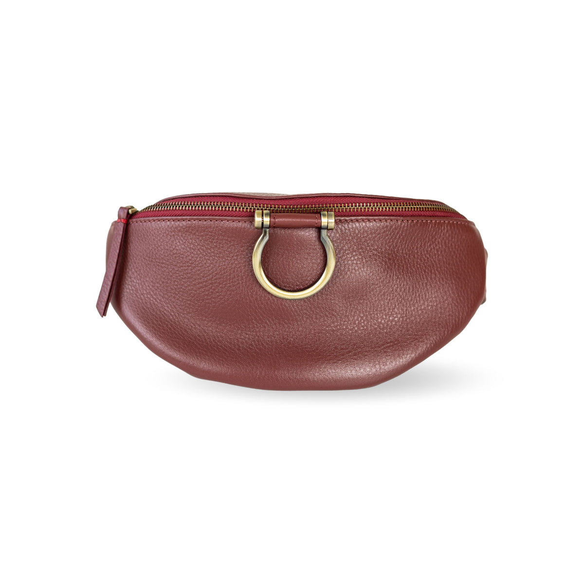
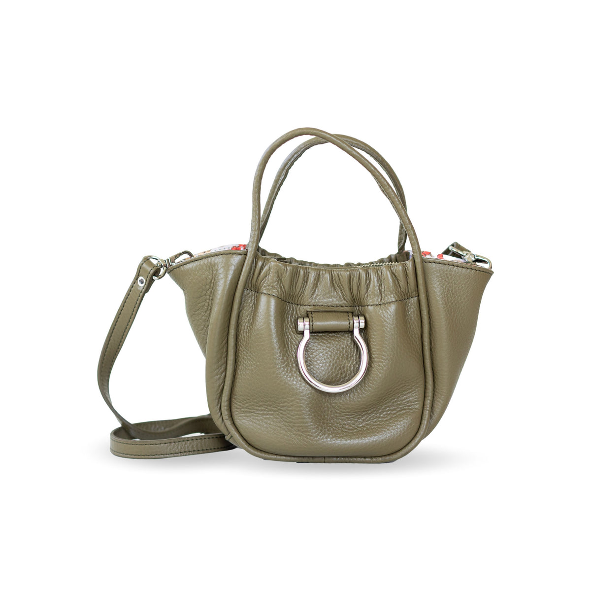
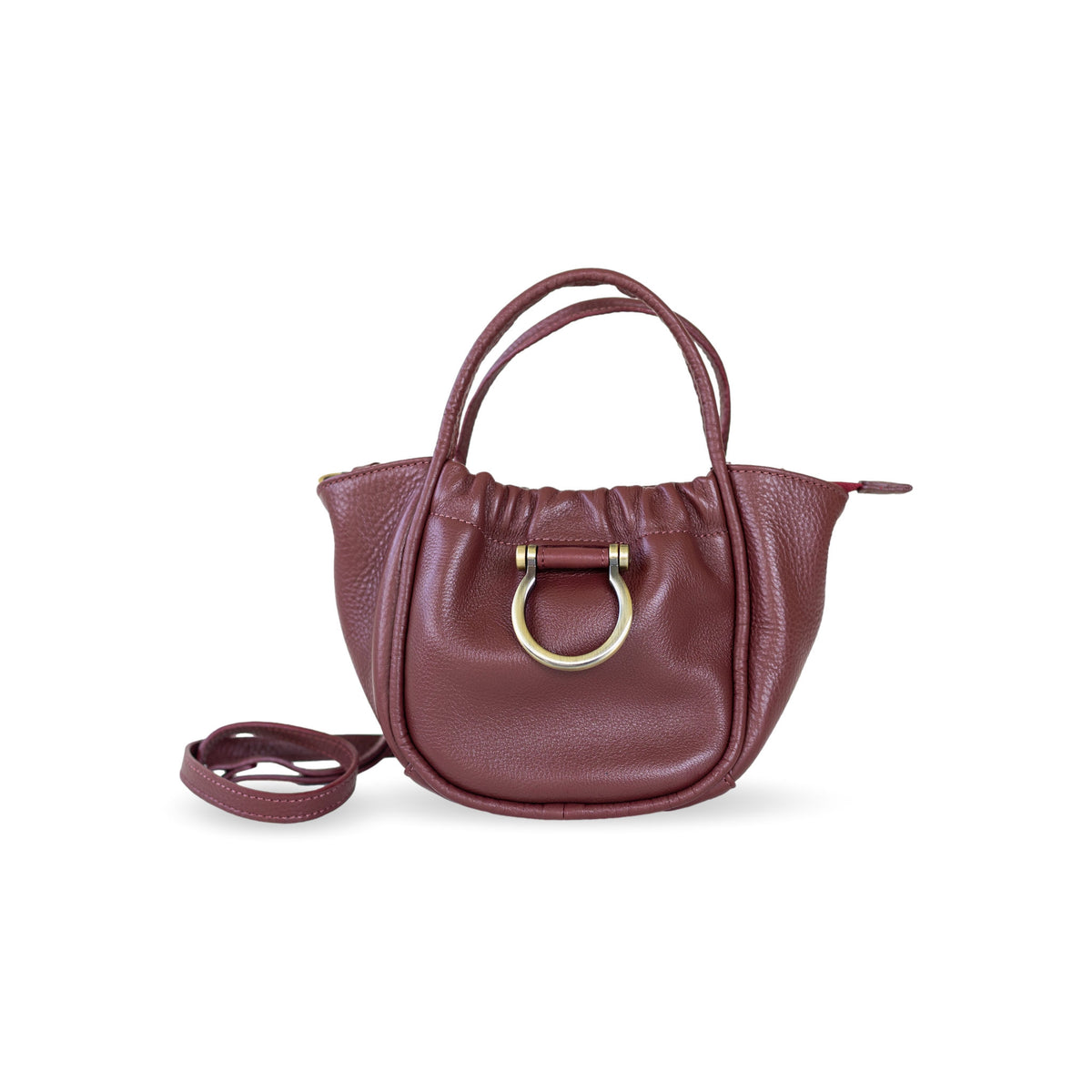
palette. Red Mahogany is a burgundy mellowed by brown undertones, while Arabian
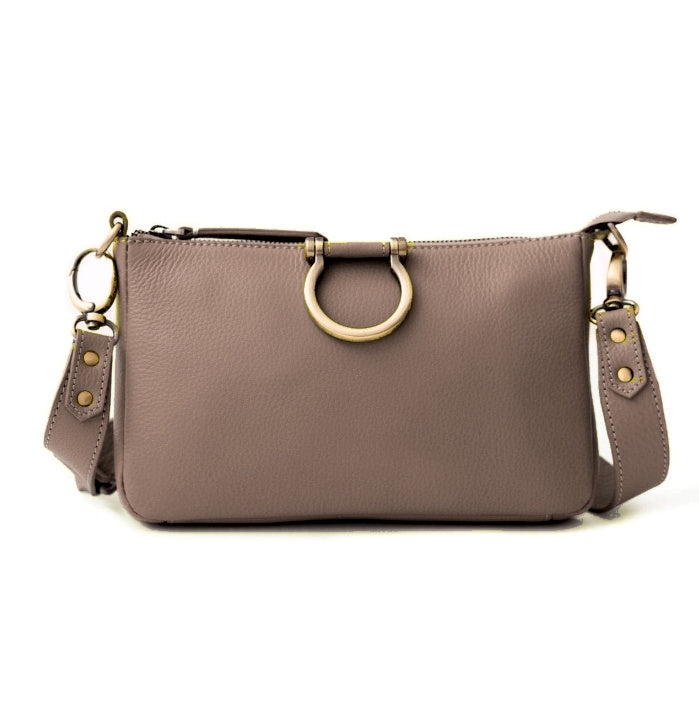
Spice offers a classic-but-not-boring rust. Toffee is a brown-family neutral with just
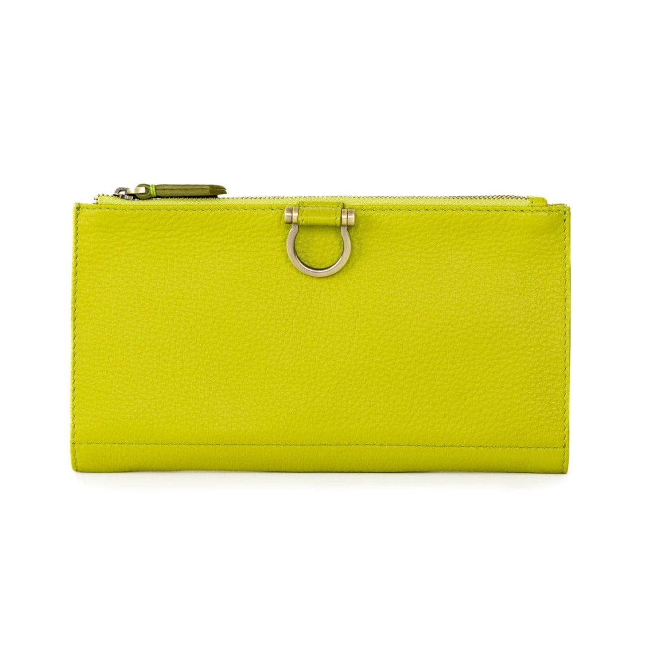
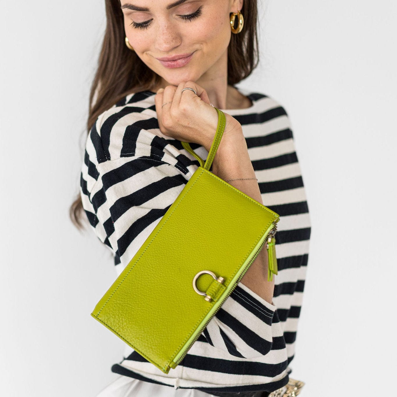
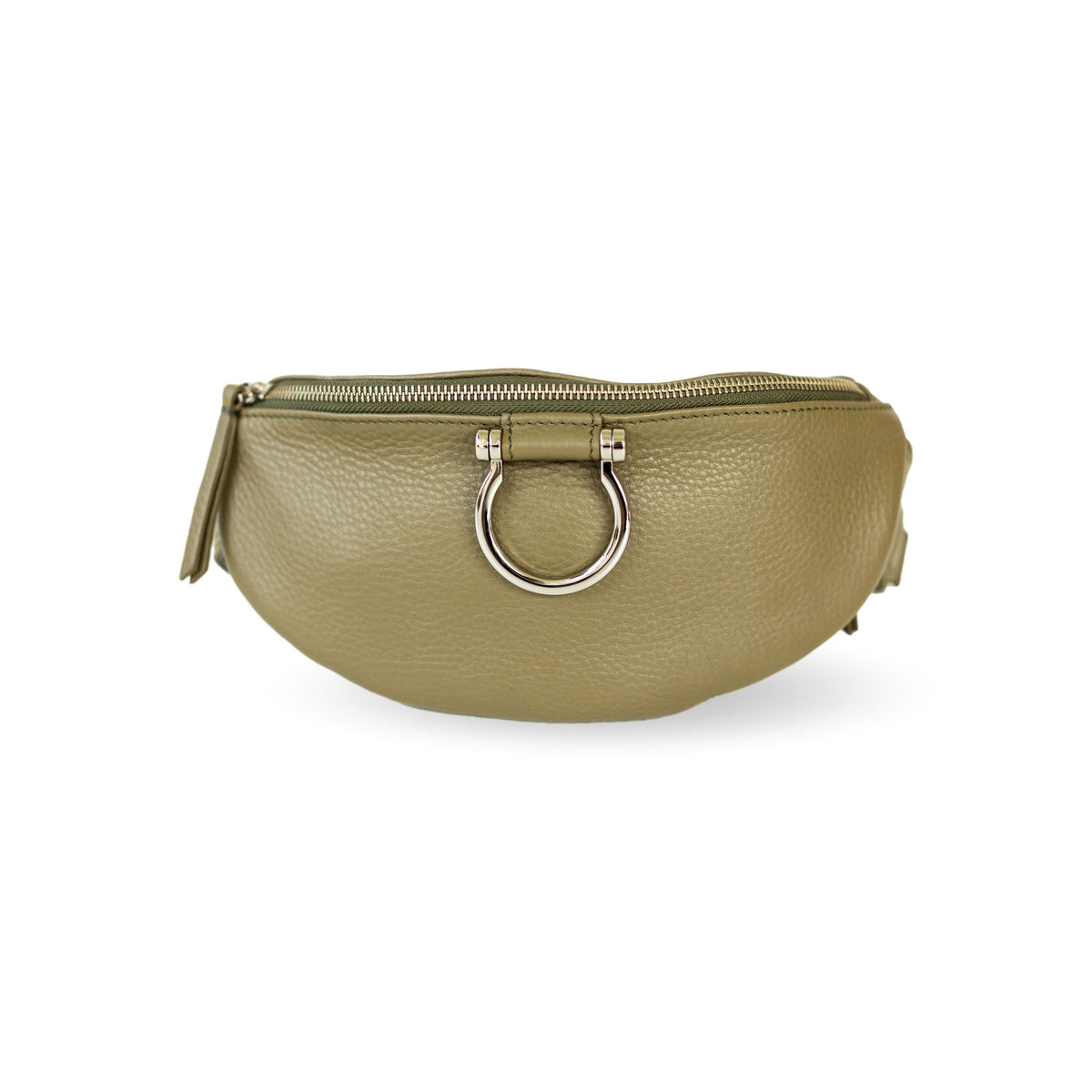
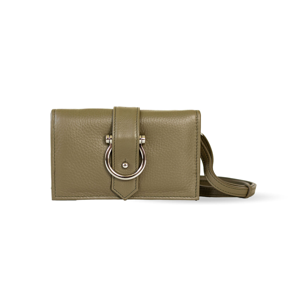
enough interest to keep it from feeling predictable. Greens are also prevalent, rangingf rom the dusky olive of Burnt Olive, through the more retro mid-tone of Green Envy, to the crisp yellow-green of Acacia.
The Unexpected
As is typical, the Pantone team also includes shades that are less expected for autumn
and winter. These are some of my favorites because they keep the palette from
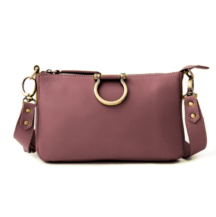
becoming too predictable. Muted Clay is a soft adobe tone. Foxglove recalls ’80s mauve but feels warmer. All Aboard is a crisp French blue, while Neptune Green falls somewhere between seafoam and jade. Festival Fuchsia feels like red’s more artsy cousin, and Poseidon is an easy-to-use deep blue with a subtle green undertone.
These unexpected additions keep us from relying too heavily on tried-and-true
combinations—and, perhaps more importantly, encourage a little extra creativity.\
So, as you consider which colors of the season are declared “in” or “out,” I encourage
you to pause before simply following the trend. Let each color speak to you.
What resonates with your individual tastes and personality? What reminds you of places
and experiences that make you smile? What works with what you already own while
perhaps adding a little element of surprise?
That, to me, is the real joy of design. Trends can provide inspiration, but they don’t have
to dictate our choices. The best spaces—and the most personal wardrobes—reflect the
people who inhabit and wear them.
Color is your playground.
Enjoy it!